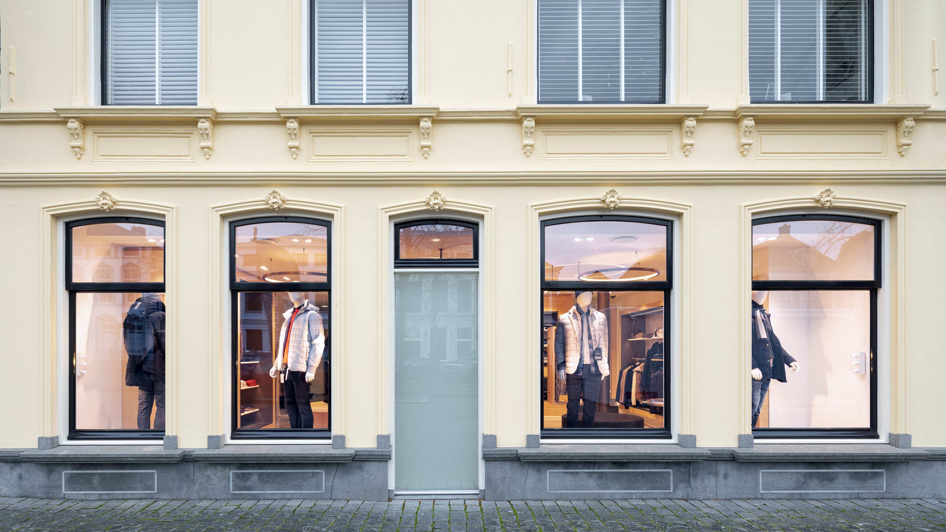
A warm canvas that focuses on clothing and customers
The retail area of men’s fashion store Gentlemen Mode was in need of a fresh new look. The goal was to give the new interior a boutique-like vibe with plenty of potential for changing collections.
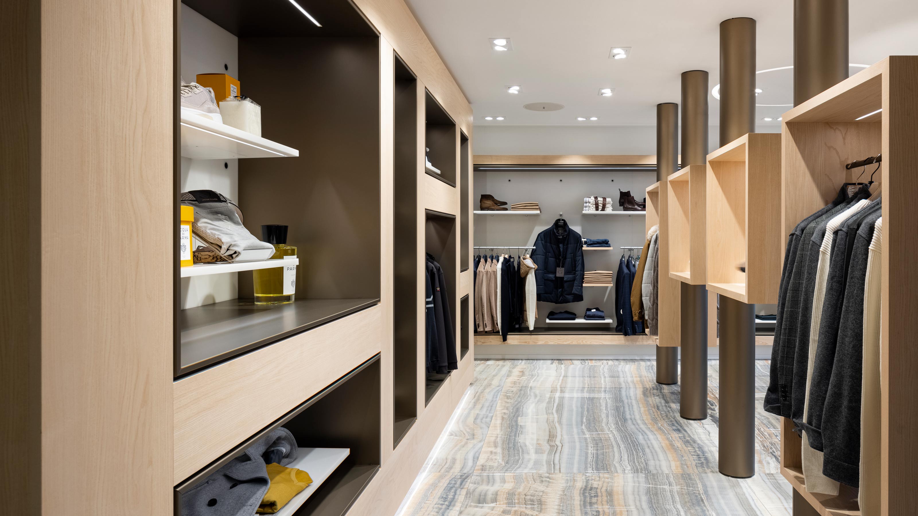
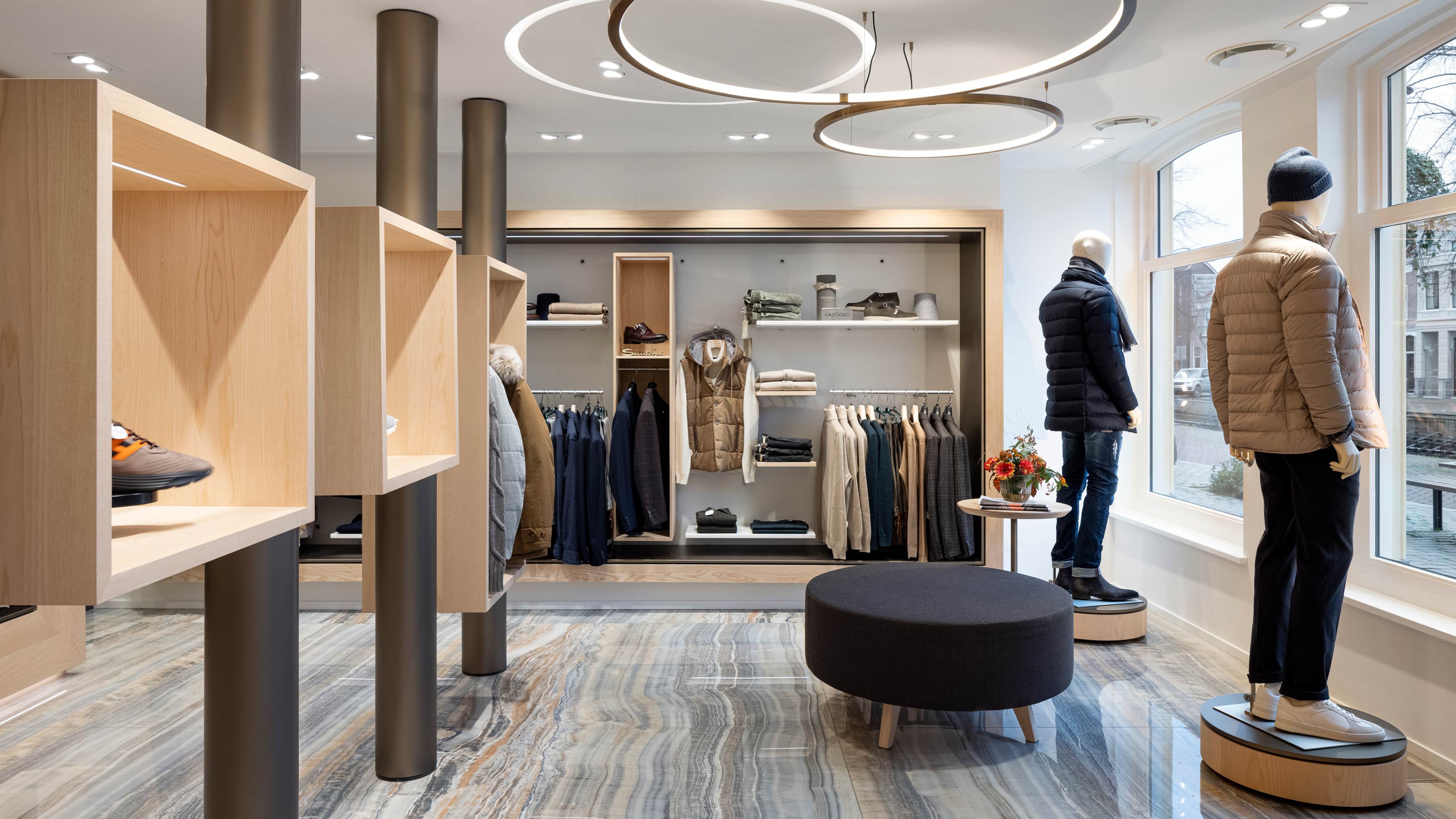
Gentlemen Mode is a fashion store in the historical centre of Oud-Beijerland. In 2002 EGM refurbished the entire store by connecting a number of properties together to create one bright, open space. Now the front section of the store was in need of a fresh new look. This retail area is very visible from the shopping street outside. The chance to give the store’s image a powerful boost both visually and tangibly was therefore seized. The client’s wish was to make the interior feel like a boutique with lots of possibilities for the changing collections. EGM interiors translated this wish into a layered layout that offers plenty of potential for an extensive and high-end presentation.
High-quality presentation
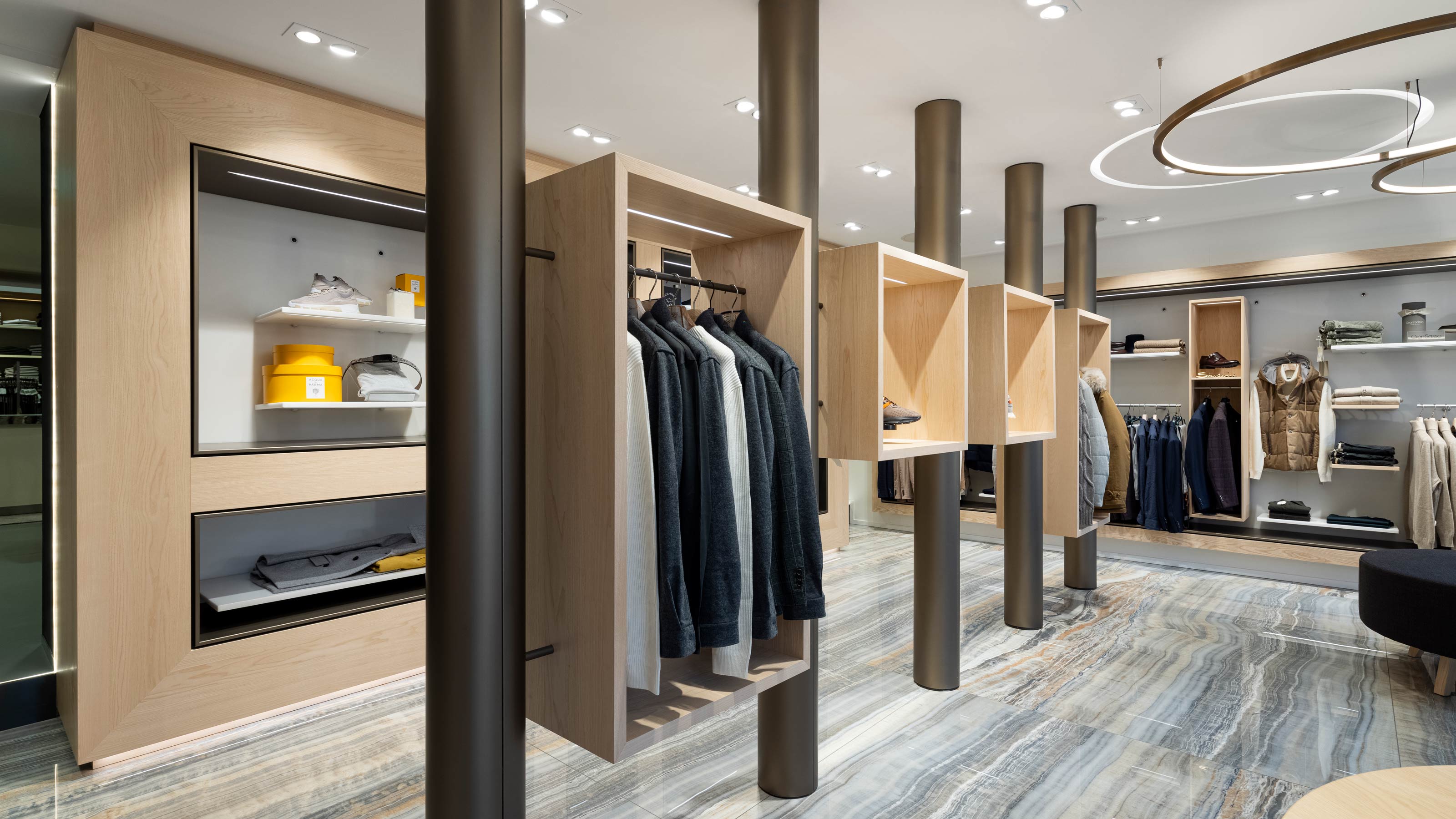
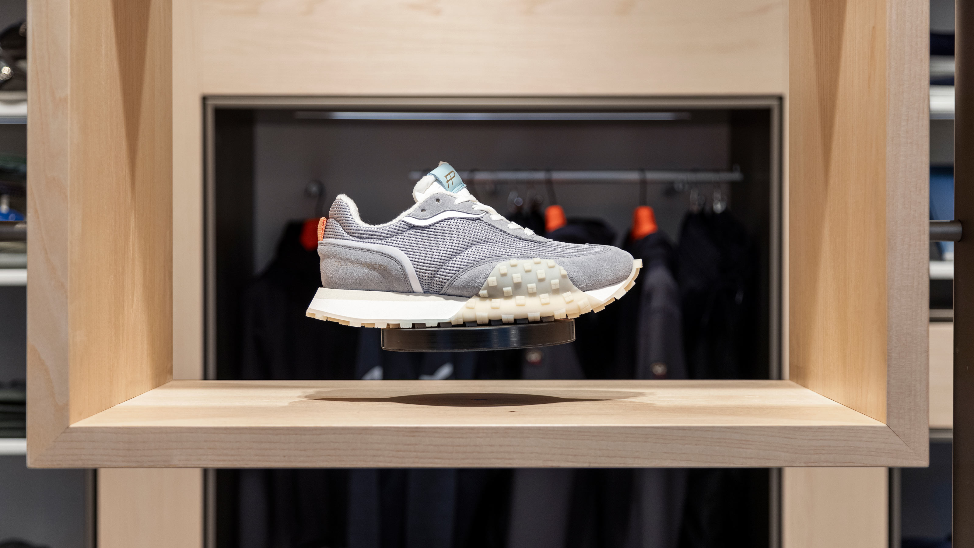
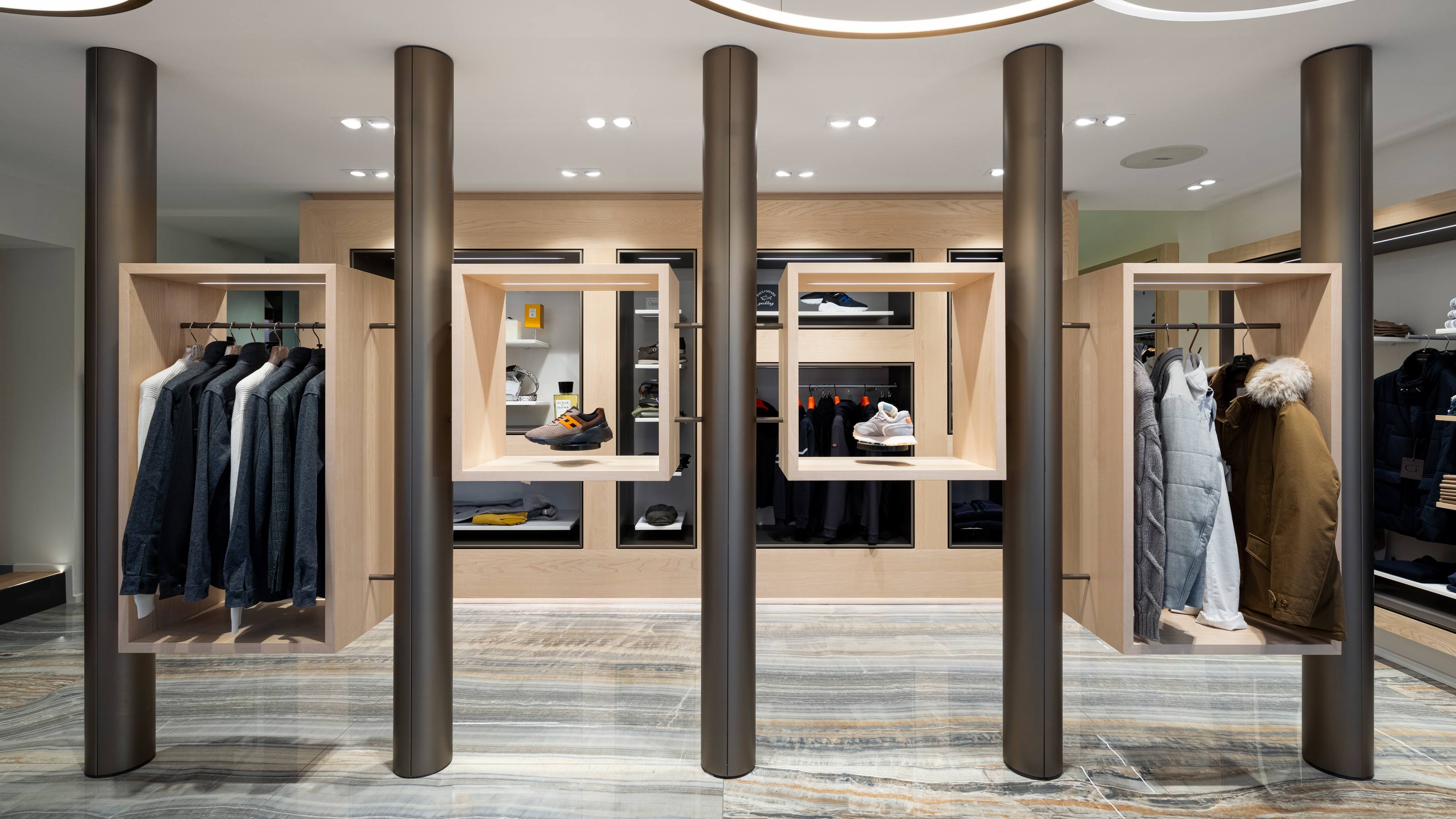
Gentlemen Mode is a top-end fashion store. That is reflected in the high-quality presentation of the fashion collections, which change every season. Everything in the new design is geared to showcasing the merchandise in the best possible way. Warm colours turn the interior into a canvas that provides a neutral basis for the fashion and accessories. Of particular note are the ‘zero gravity’ shoe platforms in the open display units in the middle of the store. A built-in electromagnet allows the platforms to float and turn. The mannequins in the display windows doesn’t stand still either but turn slowly, offering perfect views of the various styles from both the street outside and the interior.
Thanks to the ‘personal shopping box’, customers can set items aside and continue browsing.
Jeroen de Bruijn - interior architect at EGM interiors
Personal shopping box
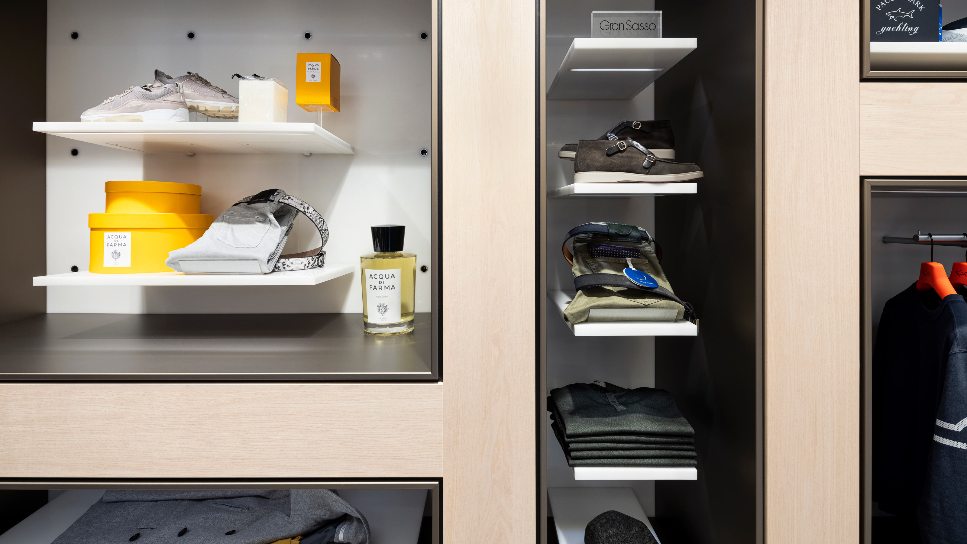
A distinctive feature of Gentlemen Mode and its staff is the personal attention given to every customer. This attention is rooted in the interior design. For instance, individual elements have rounded corners to ease movement around the store. Wall displays include spaces where customers can hang or place items while they browse. These ‘personal shopping boxes’ offer customers the service of briefly reserving items or of trying out clothing combinations at their leisure.
Recognizable materials
Recognizable materials have been used to make the presentations even more unique. All new items of furniture are finished in ash veneer. Wall displays consist of a frame of anodized aluminium, ensuring that the structure of the material remains visible. The rear walls of the displays are made of HI-MACS coloured with a ceramic granulate. To highlight the transition from one material to the next, a small space is left between the frame and the wall. A striking ceramic floor with a natural stone look lends the interior its unique feel.
Flexibility
The compact space in this area of the shop is optimally utilized by playing with depth. The row of five columns in the centre of the shop, one of which is load-bearing, adds a layered quality and orders the interior. Overhead, circles of light, some of them integrated into the ceiling and some varying in height, enhance the sense of spaciousness. Moreover, the flexible arrangement of the new wall displays makes maximum use of the space. Presentation shelves can easily be repositioned, allowing the shop layout to change with the collections. Each of the detachable shelves is fitted with LED lighting that switches on when the unit is attached. As a result, the flexible lighting scheme is optimally adapted to the changing presentations.
Photography: Stijnstijl Fotografie

