Contemporary new facade as characteristic element of cityscape
Modern elements create contrast in facade and give it richness and refinement. Careful construction with great attention to materials and detailing allow building to blend seamlessly with its surroundings without losing its identity.
Commissioned by a.s.r., EGM architects has designed a sophisticated facade for an old retail building at the corner of Karnemelkstraat and the bustling Eindstraat on the edge of the old city centre of Breda. This sensitive and important location forms part of the protected streetscape that marks the entrance to the city centre.
Traditional design with contemporary identity
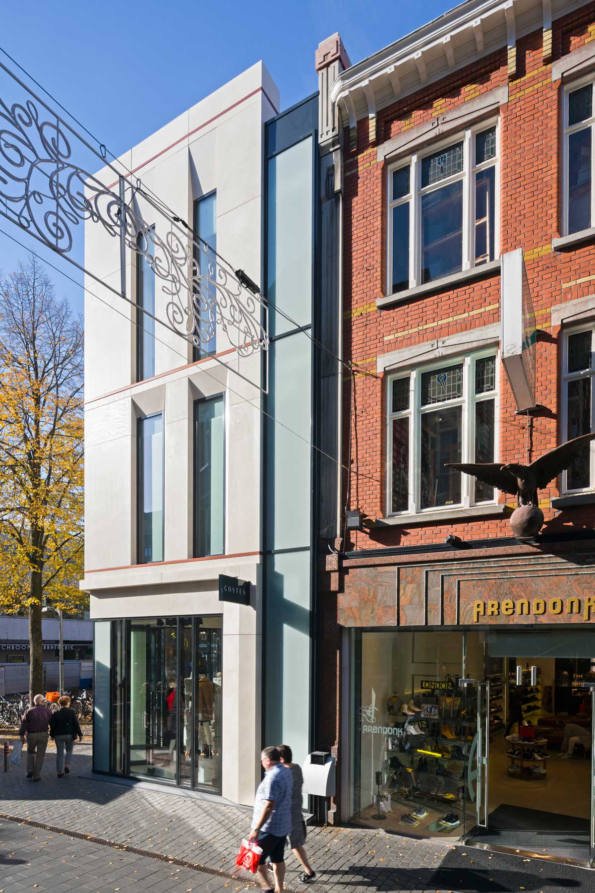
The facade design by EGM was inspired by the historical architecture of the adjoining buildings and those that graced this street corner long ago. With its rich contemporary detailing, this building forms a valuable and characteristic element of the streetscape.
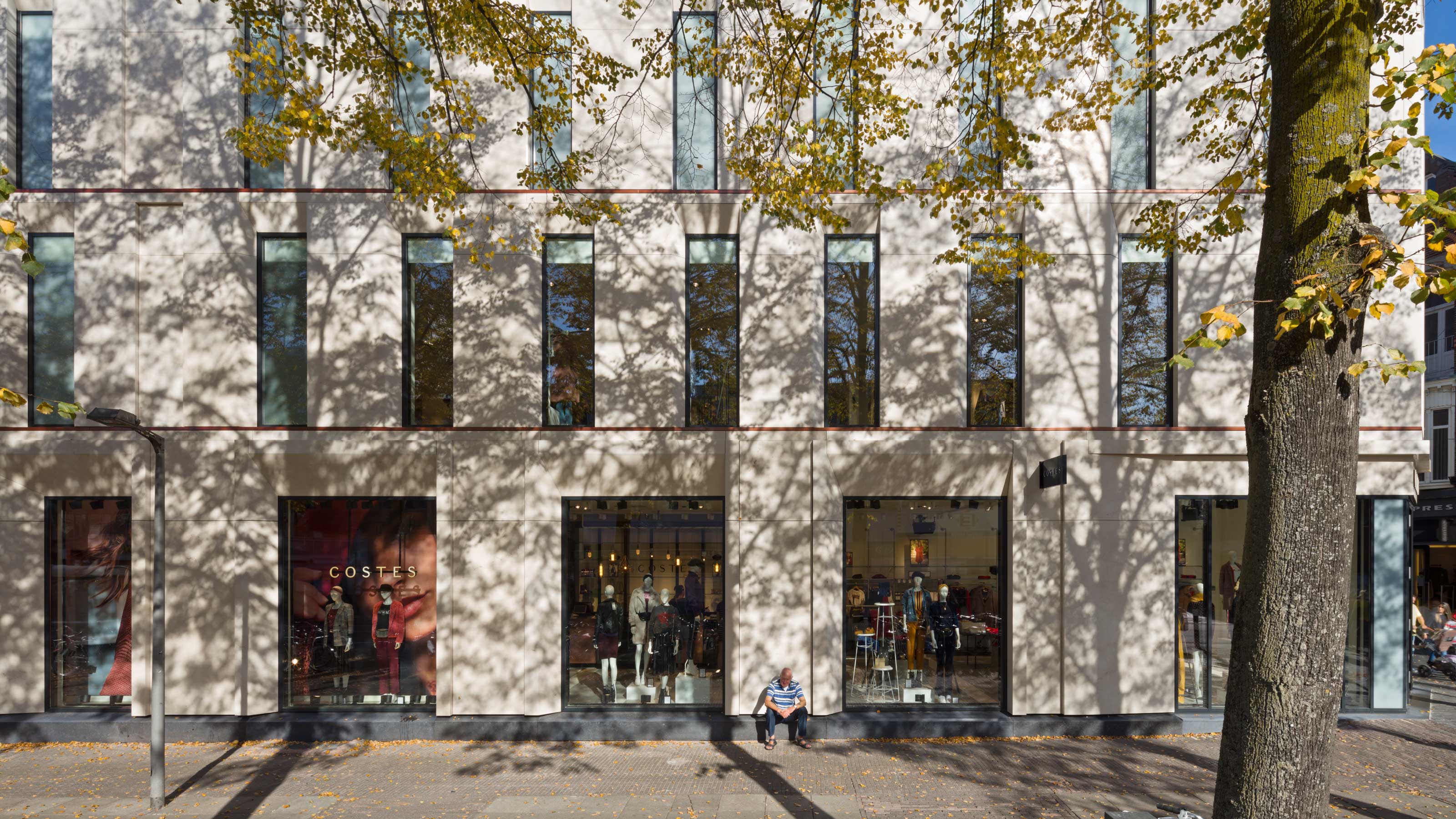
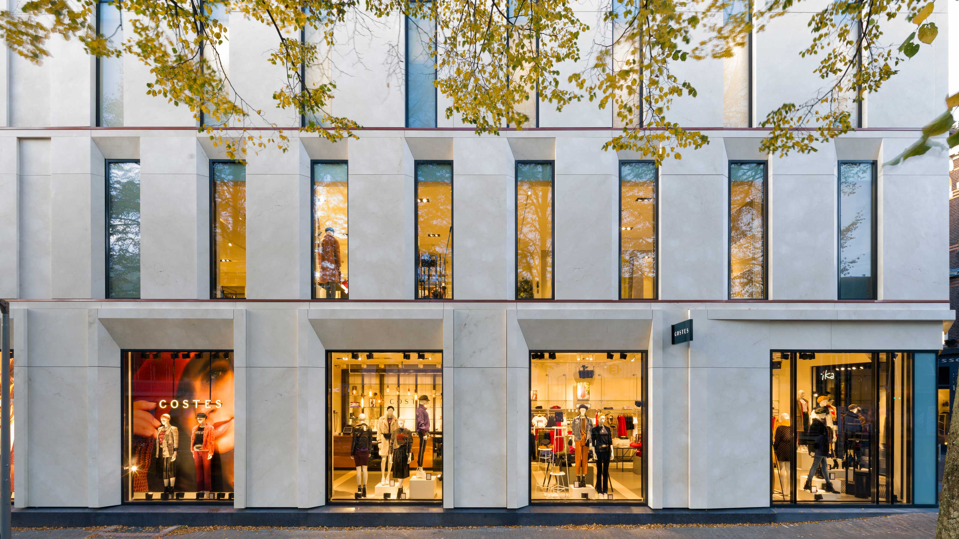
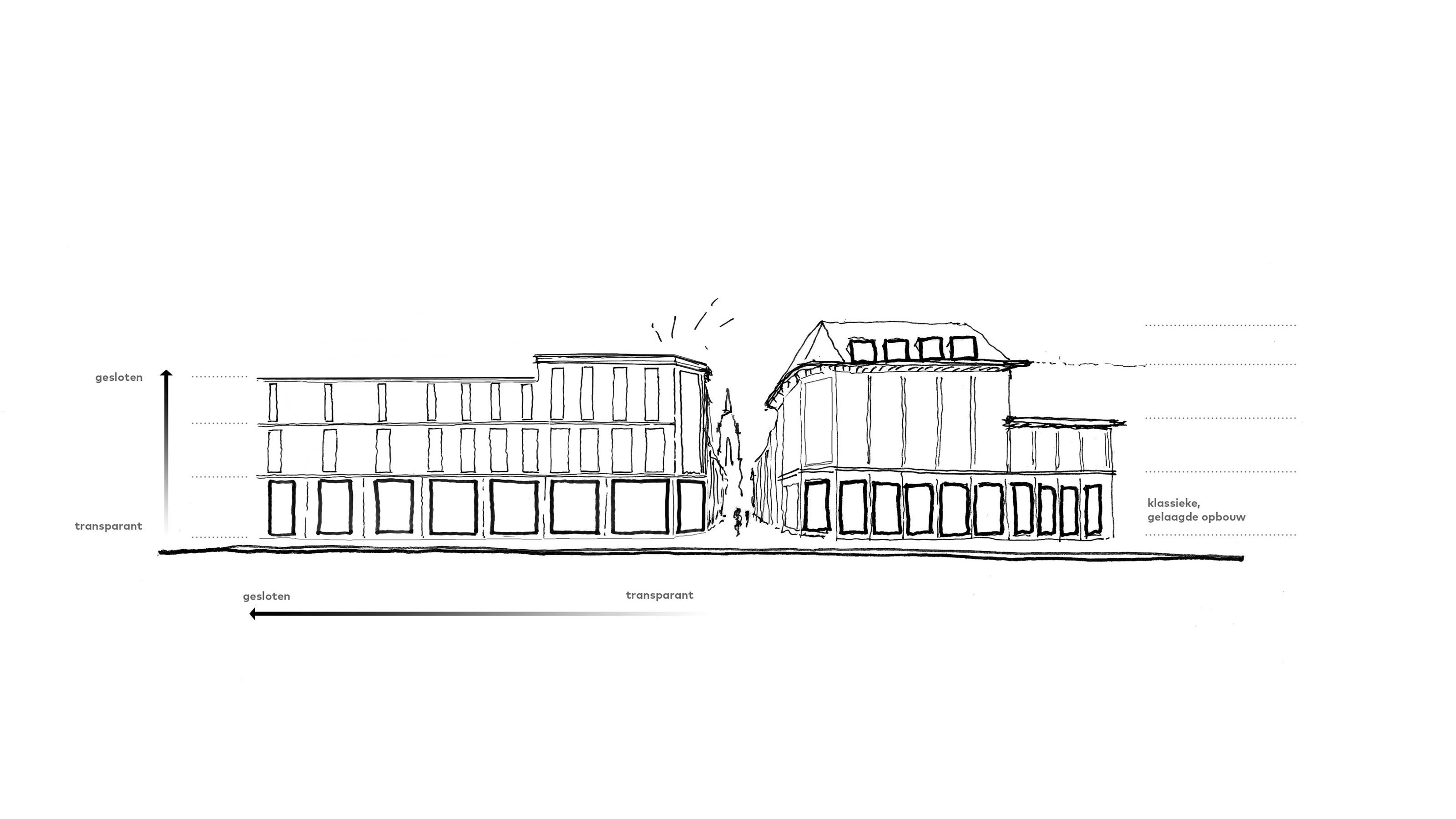
Owing to its traditionally layered composition, the design is in keeping with the city-centre context, but contemporary detailing and materials lend it a character all of its own. The building plinth features large sections of glazing that bring daylight and transparency into the interior. The stone surrounding the glass accentuates the building plinth and enriches the street level.
Added emphasis is given to the corner of the building. The raised parapet strengthens the character of the corner within the urban context and marks the transition to the old city centre. Maximum transparency around the entrance and on the first floor showcases the spaces at the rear, as befits a modern retail building. The design blends with the scale, dimensions and character of the neighbouring structures.
Richness and refinement
At first-floor level the facade is more closed in character. Tall and narrow windows with recessed frames lend the building a classically solid appearance. Diagonally placed reveals, subtle differences in dimensioning of the windows and recessed stone planes elegantly counterbalance the rigidity of the traditional architecture and offer a contemporary and modern interpretation of this traditional composition.
Sand-coloured natural stone with its light tone forms a welcome change to the previous dark and sombre facade. Modern elements such as anthracite-coloured aluminium window frames create contrast and lend the design a richness and refinement. It is precisely this attention to materials and details that anchors the building to its context and, at the same time, gives it a strong identity of its own.
The new shop is scheduled to open its doors in June 8.


