Everything centres on the experiences of children
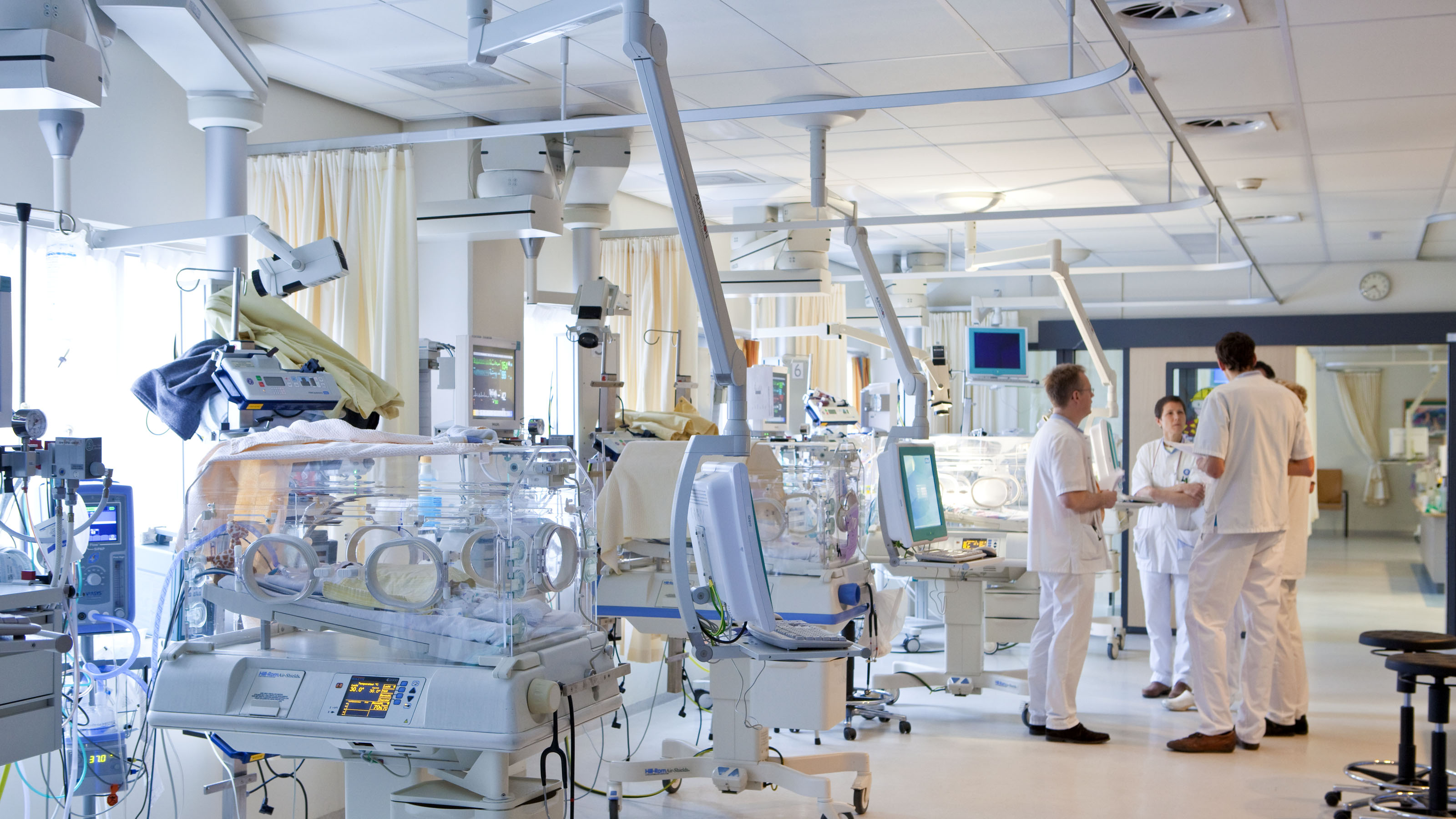
The Wilhelmina Children’s Hospital (WKZ) is one of the foremost clinical centres dedicated to paediatric care nationwide. Here, every child is treated as a child first and foremost, with the environment deliberately crafted to form an integral part of the healing process.
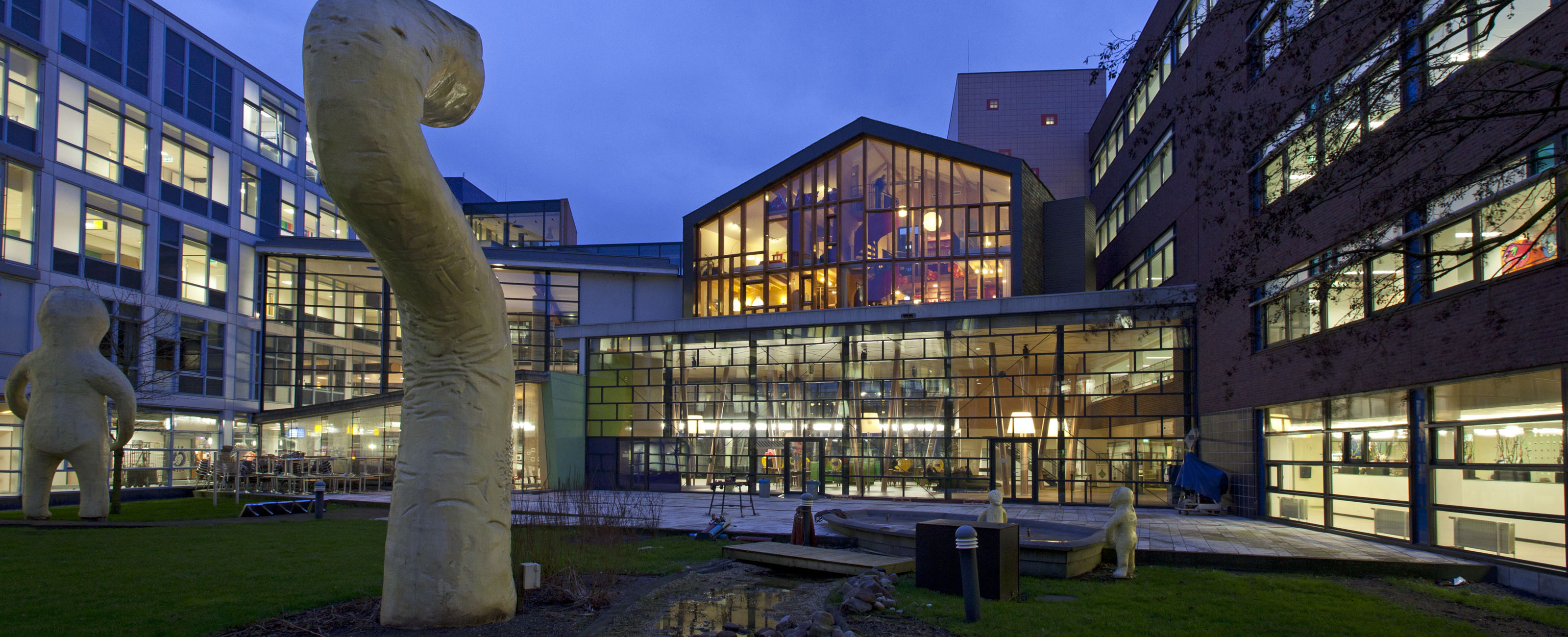
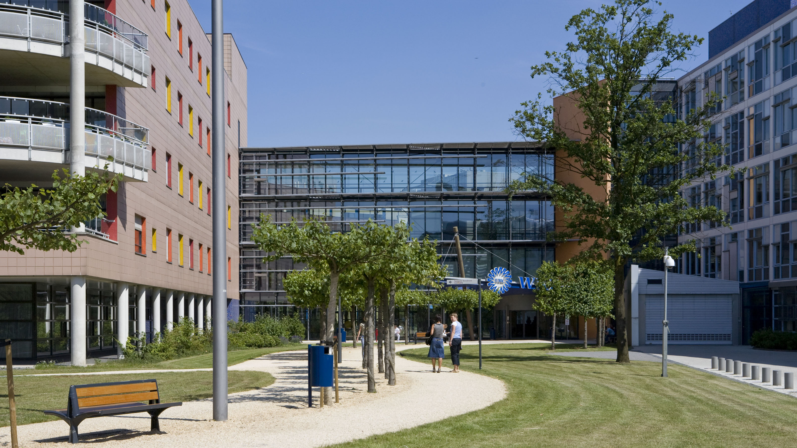
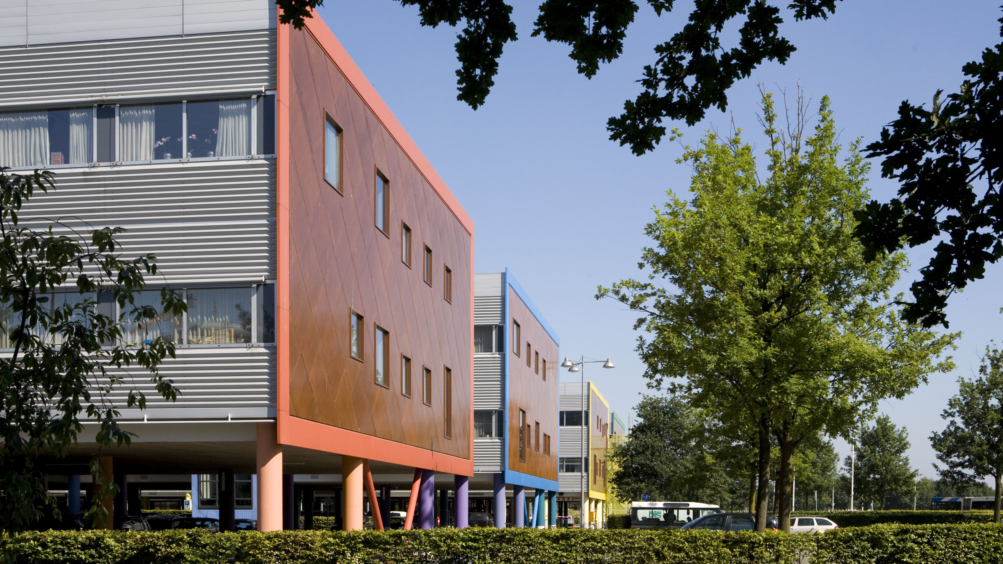
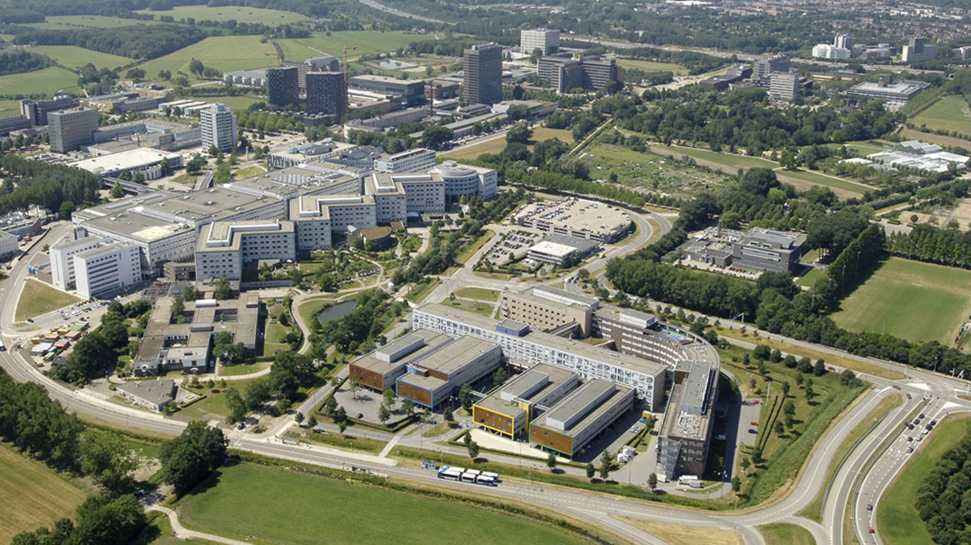
View the entire projectThe Wilhelmina Children’s Hospital, part of the University Medical Centre Utrecht, is a leading specialist hospital for children from across the country. It stands out due to its distinctive design and use of materials and colours, with children’s imagination and experience at its heart.
Child-centred design
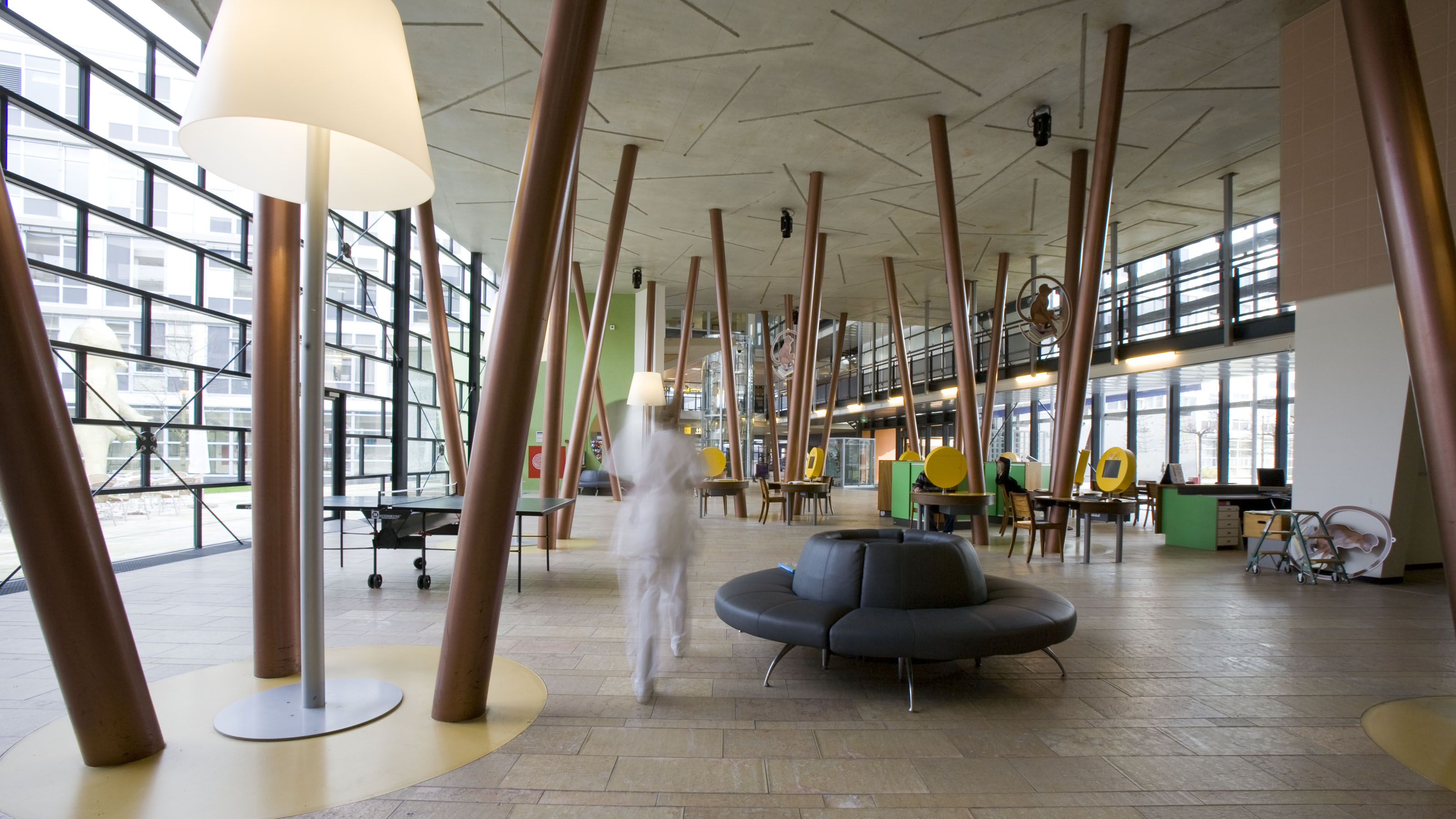
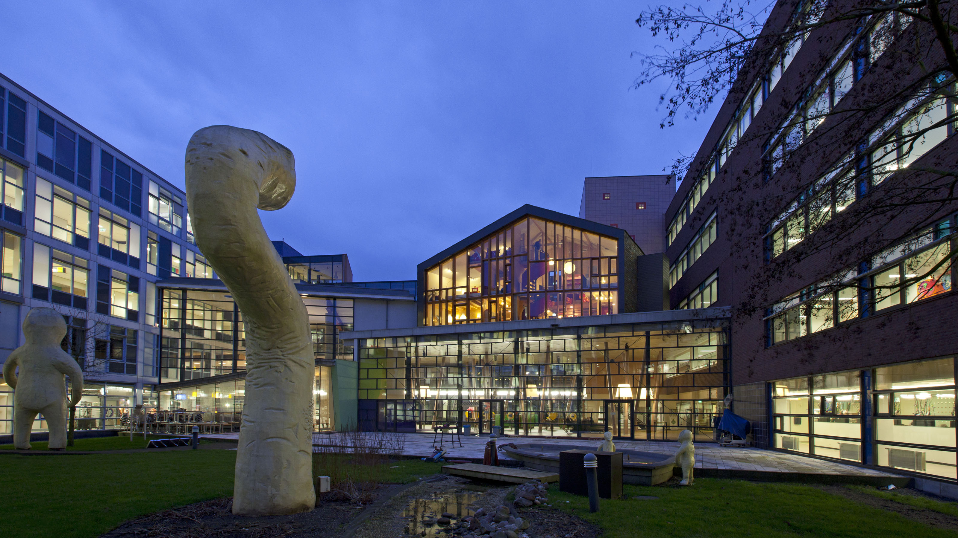
Every detail of the hospital’s design enhances the child’s experience. From the theatrical children’s café to reception desks inspired by Captain Nemo’s submarine, the spaces are designed to intrigue, comfort and distract young patients, helping to reduce anxiety and encourage creativity.
Contextual integration
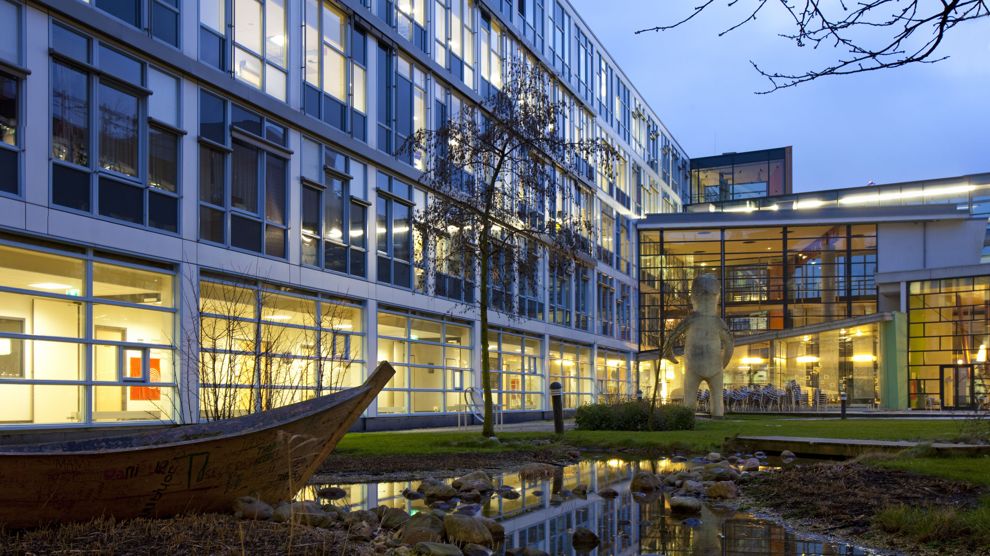
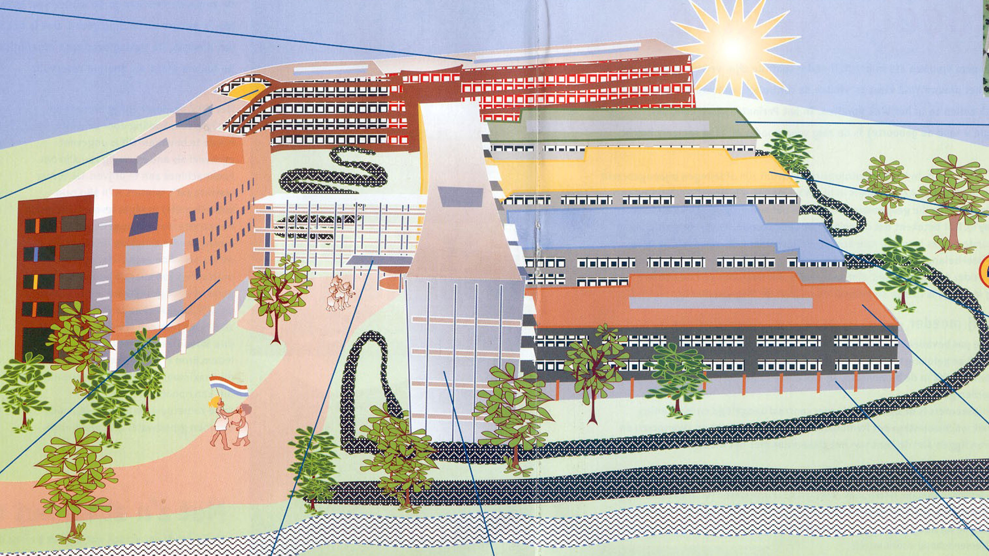
The building reflects the surrounding landscape and urban structure, respecting local morphology and orthogonal patterns while asserting its own unique architectural identity through distinctive forms and carefully selected materials and colours.
Robust exterior, welcoming interior
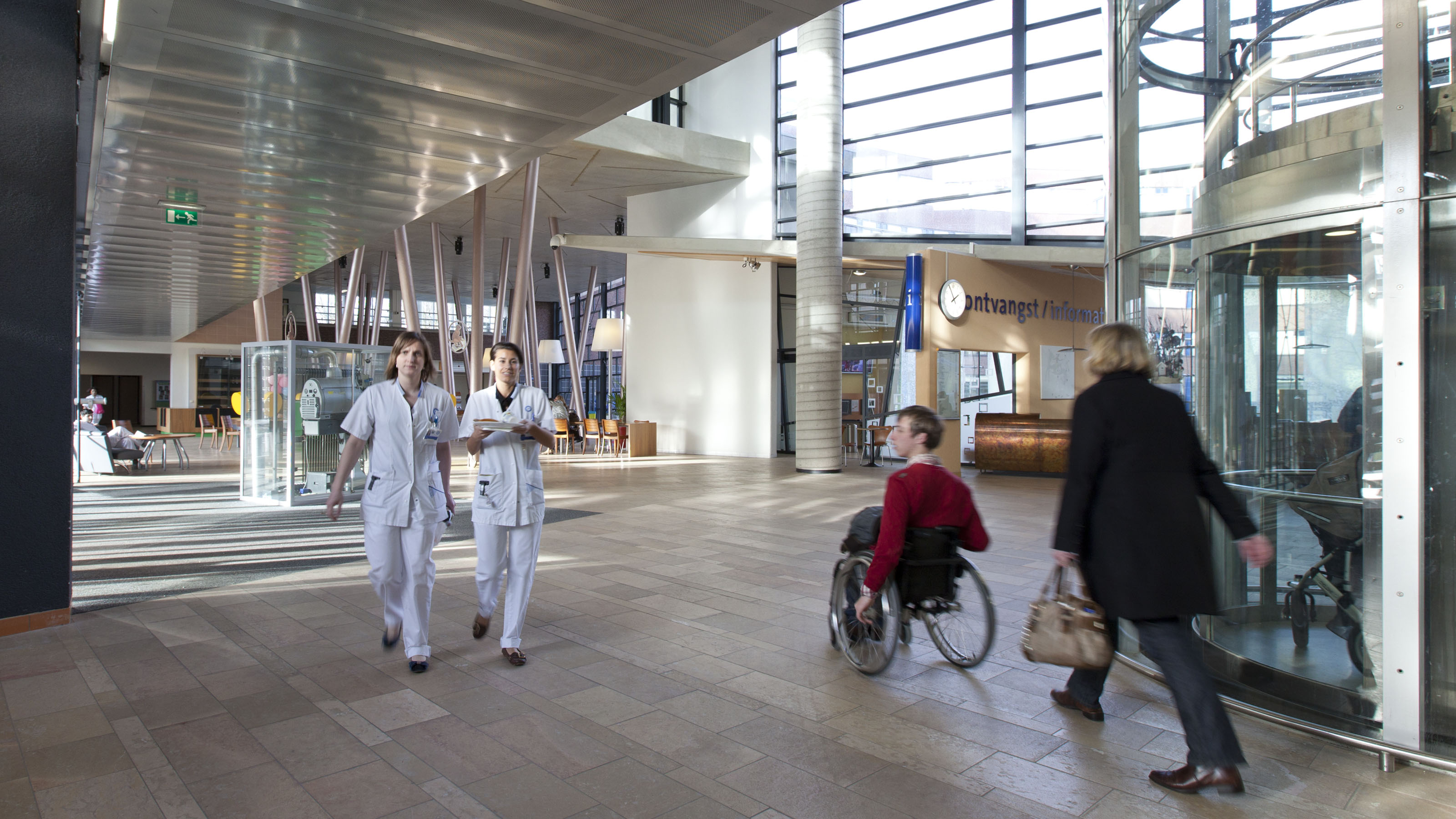
Externally, the use of textured stone, timber cladding and aluminium profiles conveys durability and craftsmanship. Inside, the atmosphere softens with light tones and natural materials, creating a warm, tranquil environment that supports children’s well-being and reassures families.
Centralised meeting point
Five interconnected building sections converge within a spacious central hall, which acts as the vibrant heart of the hospital. This hub allows patients, visitors and staff to move seamlessly between spaces, fostering social interaction and instilling a sense of community and security.
Family-Centred Care
The hospital prioritises children’s need for play and connection. A rooftop playground offers fresh-air recreation, while patient rooms feature large glazed walls facing corridors to prevent isolation. Built-in guest beds enable parents to stay with their children around the clock, greatly aiding comfort and recovery.
Education and creative activities
Beyond medical treatment, the hospital supports continuation of education through a dedicated hospital school with tailored programmes. Creative expression is encouraged via the children’s theatre, providing entertainment and distraction during hospital stays and promoting emotional well-being.
