Five themes: the city of Delft, the polders, glasshouses, the beach and the metropolitan area
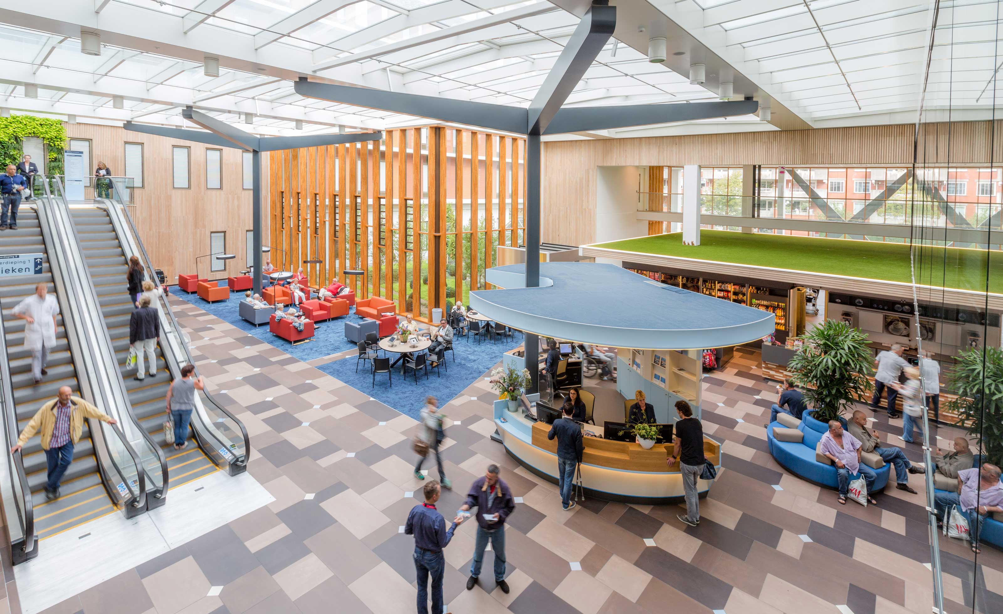
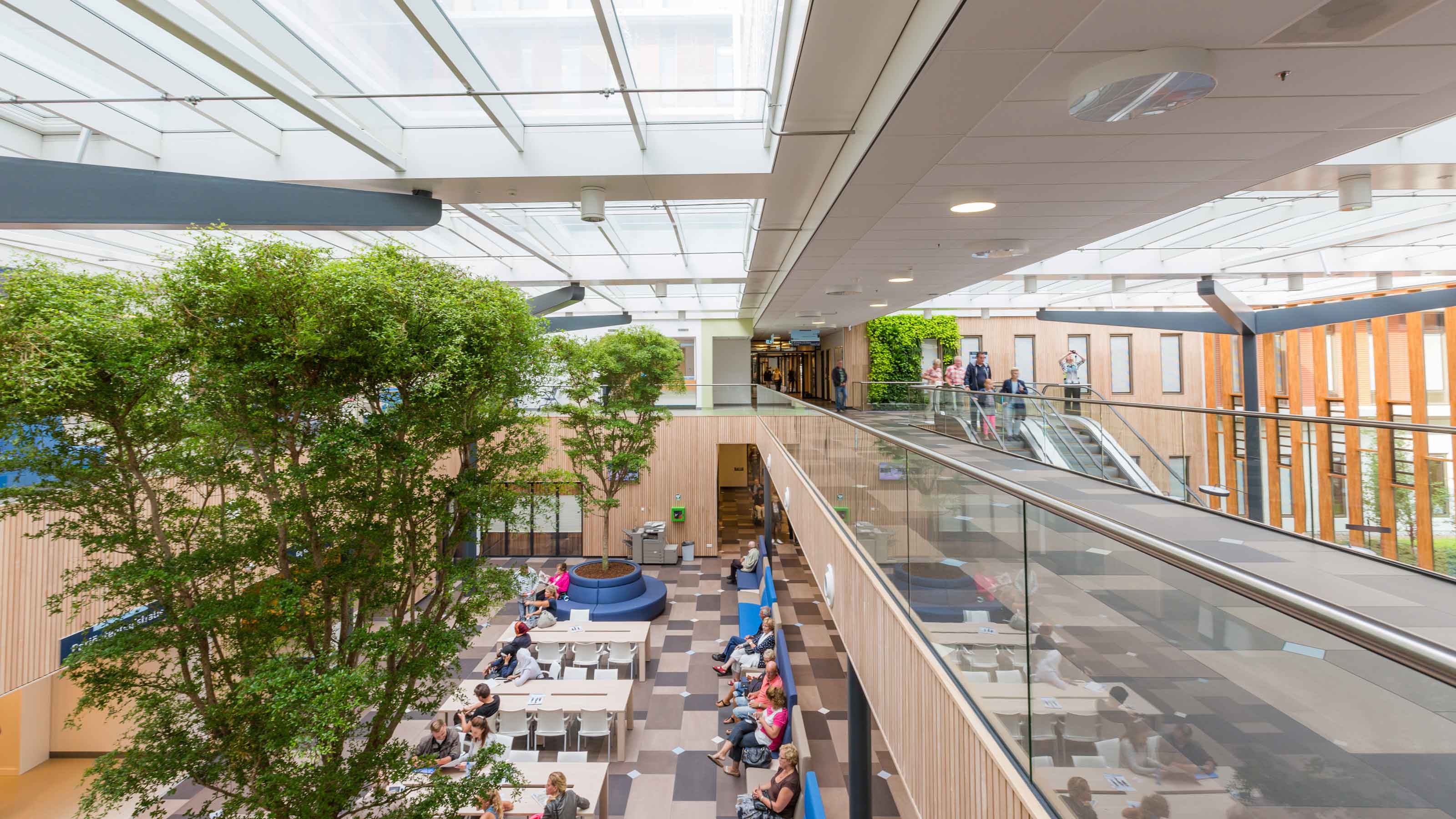
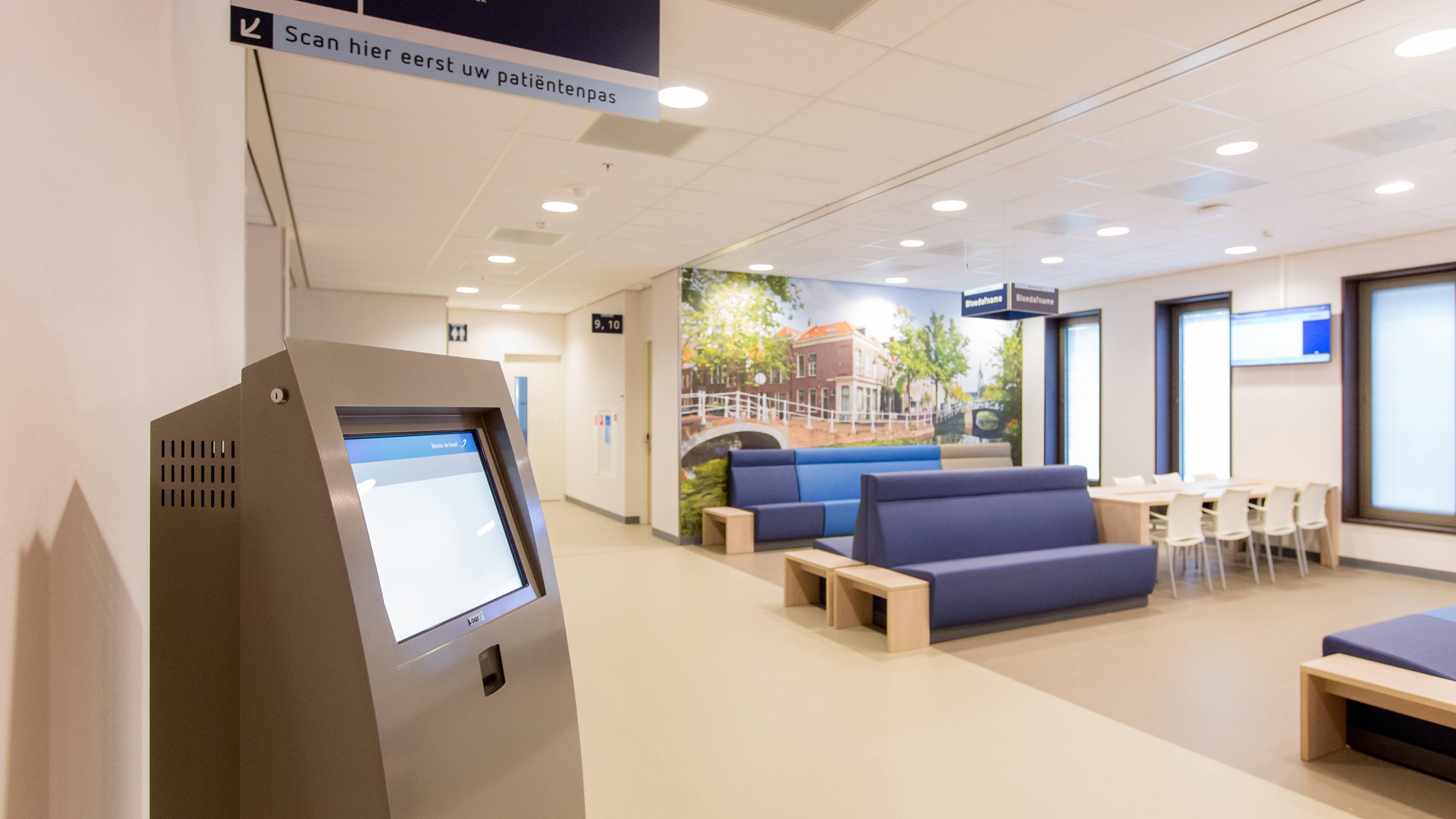
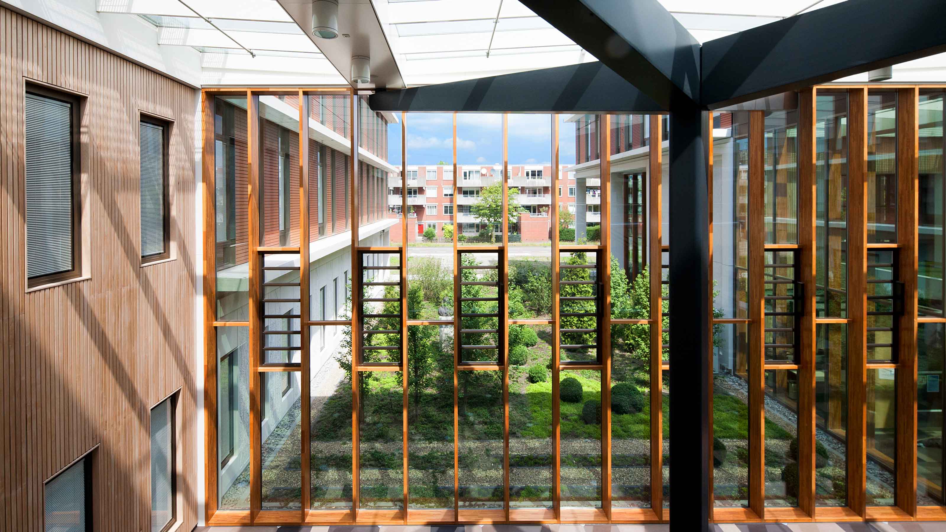
The design refers in various ways to the City of Delft and the surrounding service area. An area in which about 450,000 people rely on the Reinier de Graaf Hospital. These defining elements provide a recognizable and 'warm' building.
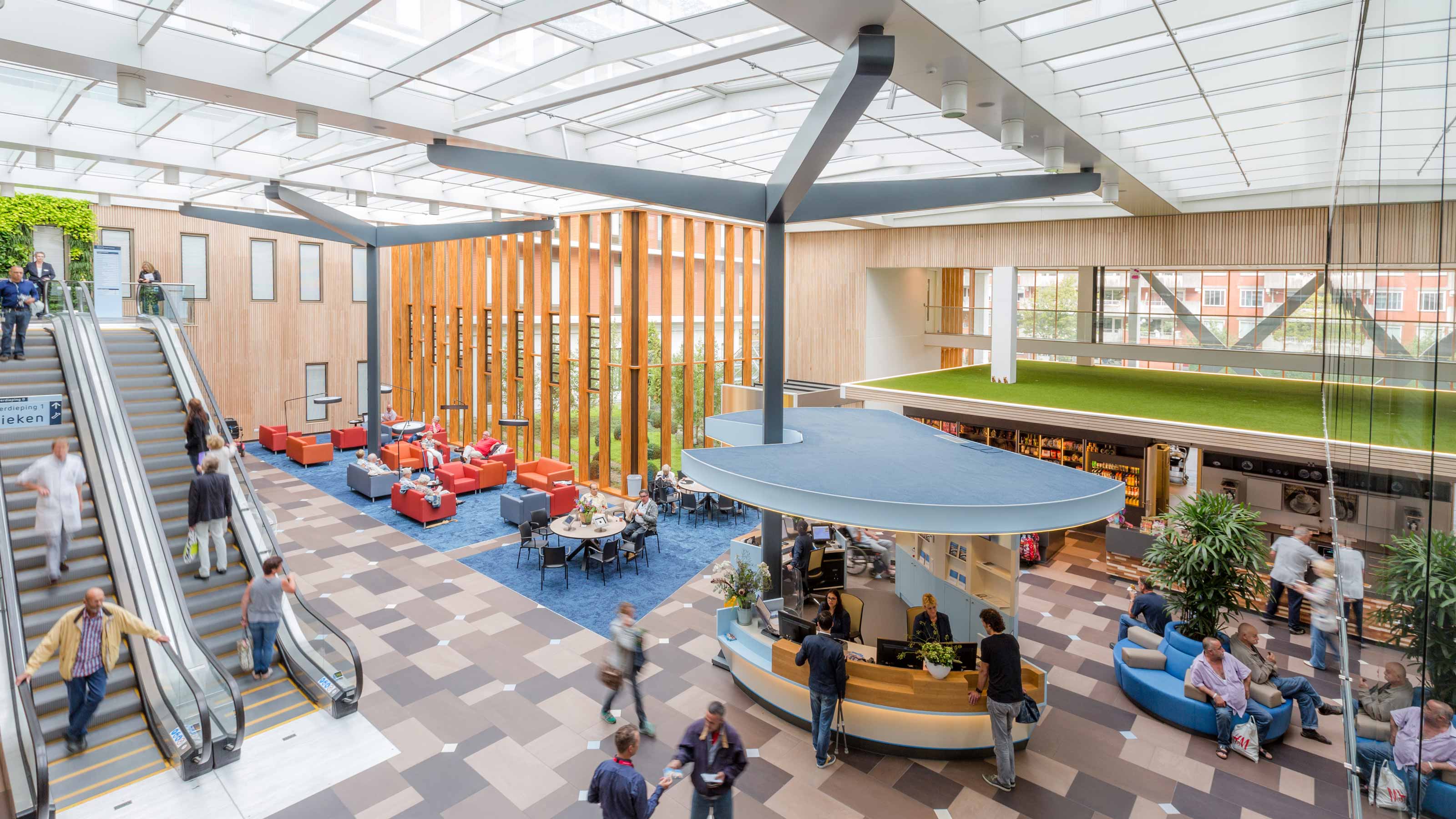
View the entire projectThe innovative and compact new Reinier de Graaf Gasthuis replaces two old hospital buildings. The new hospital is a building that exudes connectedness, both internally and externally. This was also the starting point for the new hospital. EGM architecten translated this into a design in which openness, connection and the city of Delft play a major role.
Recognizable themes from the service area
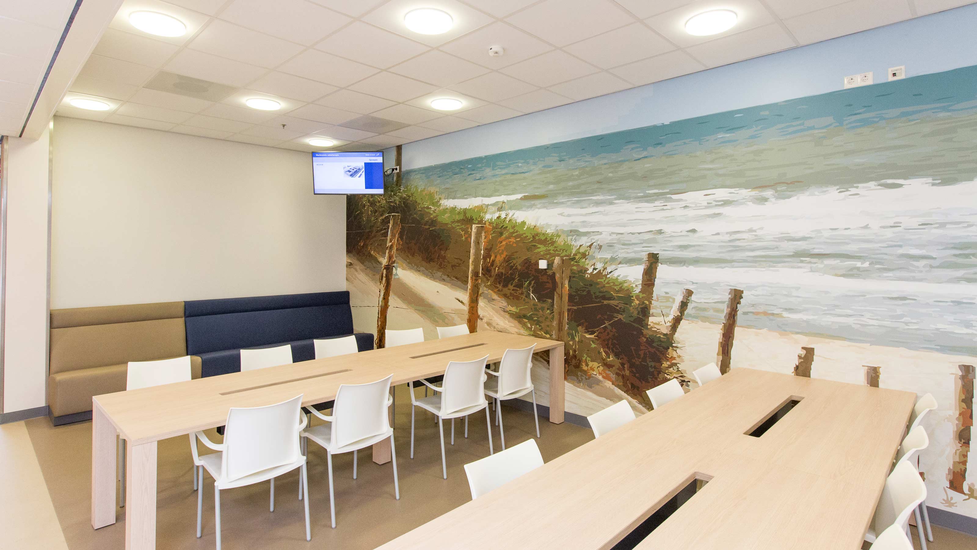
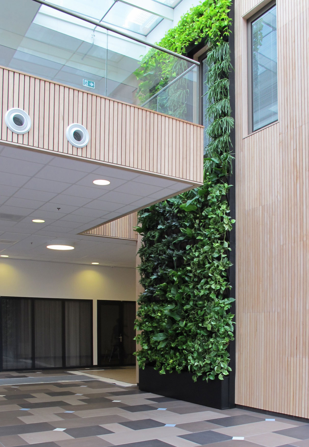
In order to make everyone feel at home, five recognizable themes from the service area were selected, namely; the City of Delft, the polders, glasshouses, the beach and the greater metropolitan area. Each theme was given its own color concept derived from photos from the area. Thus the orange theme of Delft reflects the orange roof tiles on an aerial view of the city. The warm sand yellow color refers to the beach and the green to the vast polders between Delft and the beach. The vast rows of greenhouses one can find in the polders have been translated into shades of green and gray.
Clear and Recognizable Departments
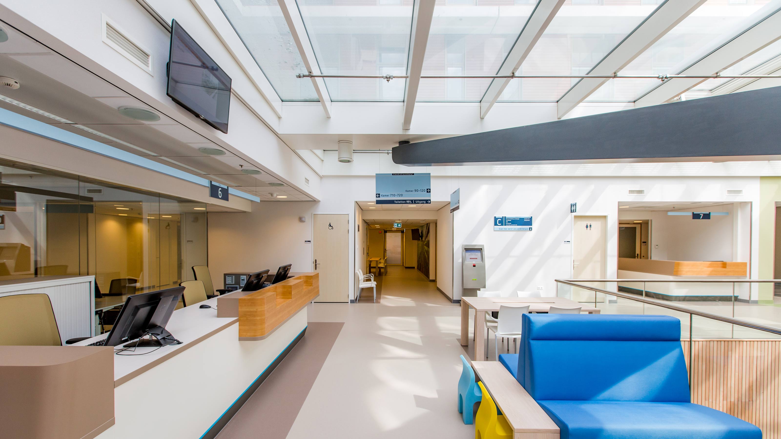
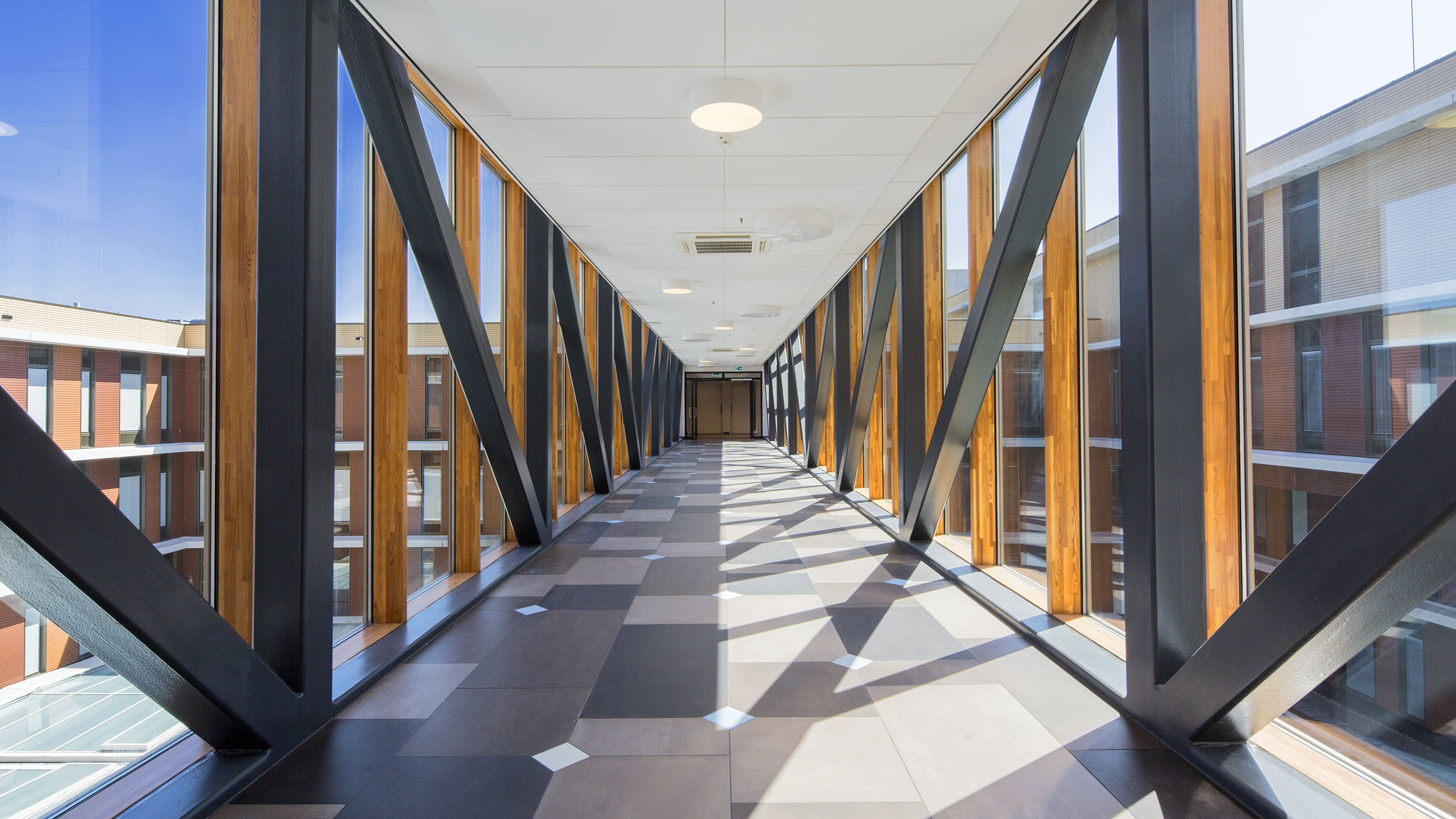
Along the main corridor, each gate leads to a departmental corridor, made easily identifiable with a color that continues from floor to wall to ceiling. This ensures the entrance to each department is immediately clear. Behind the gates, a global foundation has been applied: a warm base color in the range of warm grays that combines well with other elements.
In the public corridors, either the restroom or one side of the corridor is painted warm gray. For the Women and Children department, a gradient is applied to the protruding restroom units, with colors flowing from gate to gate, adding extra color and a sense of experience.
Comfort and Atmosphere in the Patient Rooms
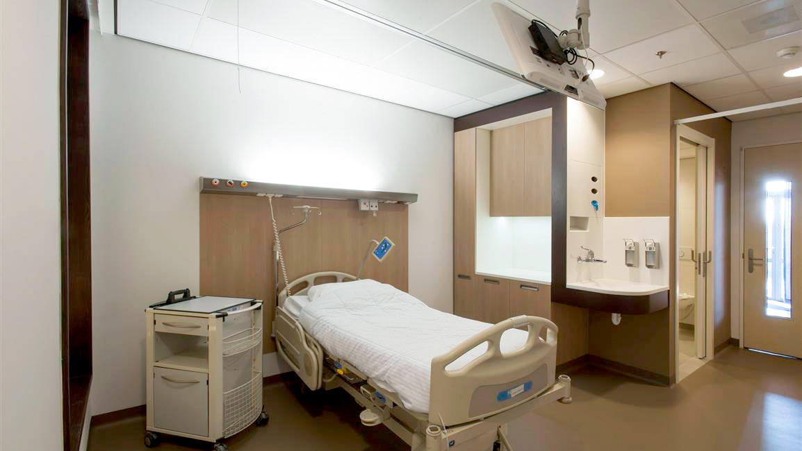
In the patient rooms, the colors of the global foundation return. The warm, soft base color creates a homely and natural atmosphere. One wall is covered with textured wallpaper, while the cabinets and bumpers are made of wood. Accents such as curtains, loose furniture, and the bedspread add pops of color. The bedspread, designed by EGM architects, features a stylized representation of the entire care area.
